
← Selected work ◈  Brand identity — smart‑home

Autoyo

A complete visual identity for a smart‑home automation brand — a logo system, colour, typography and photography built to feel as effortless as the technology it stands for.

ClientAutoyo
ScopeLogo · Colour · Type · Photography · Applications
DesignMonzology
Autoyo identity

01  Logo system

A confident geometric mark that reads clearly from a signboard down to a favicon.
Logo mark
Logo mark
Horizontal logo
Horizontal logo

02  Colour & type

A dark, engineered palette with steel‑blue gradients, paired with a clean, modern typeface.
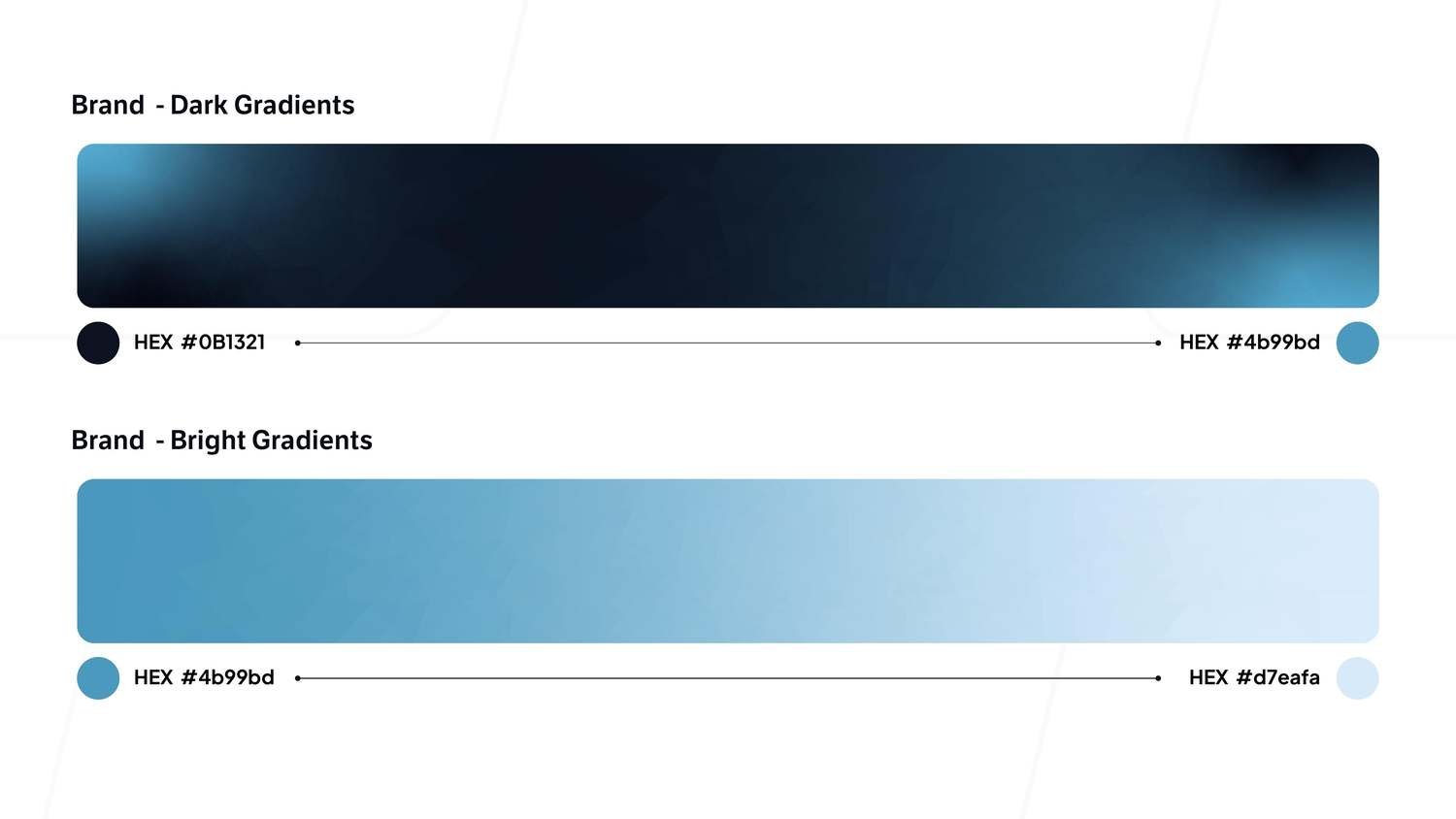
Brand gradients
Brand gradients
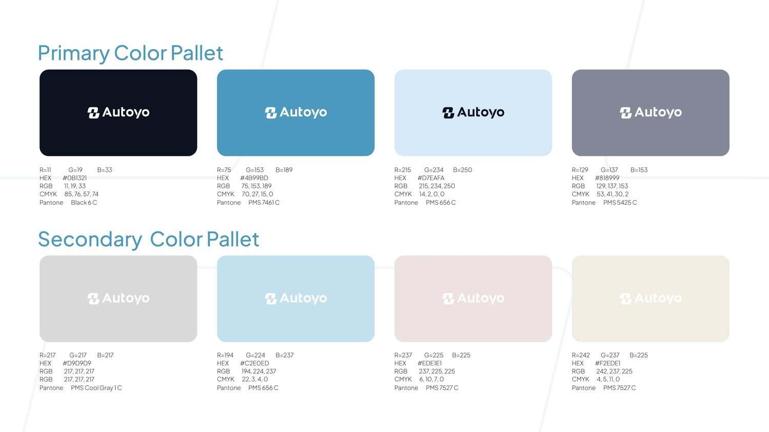
Colour palette
Colour palette
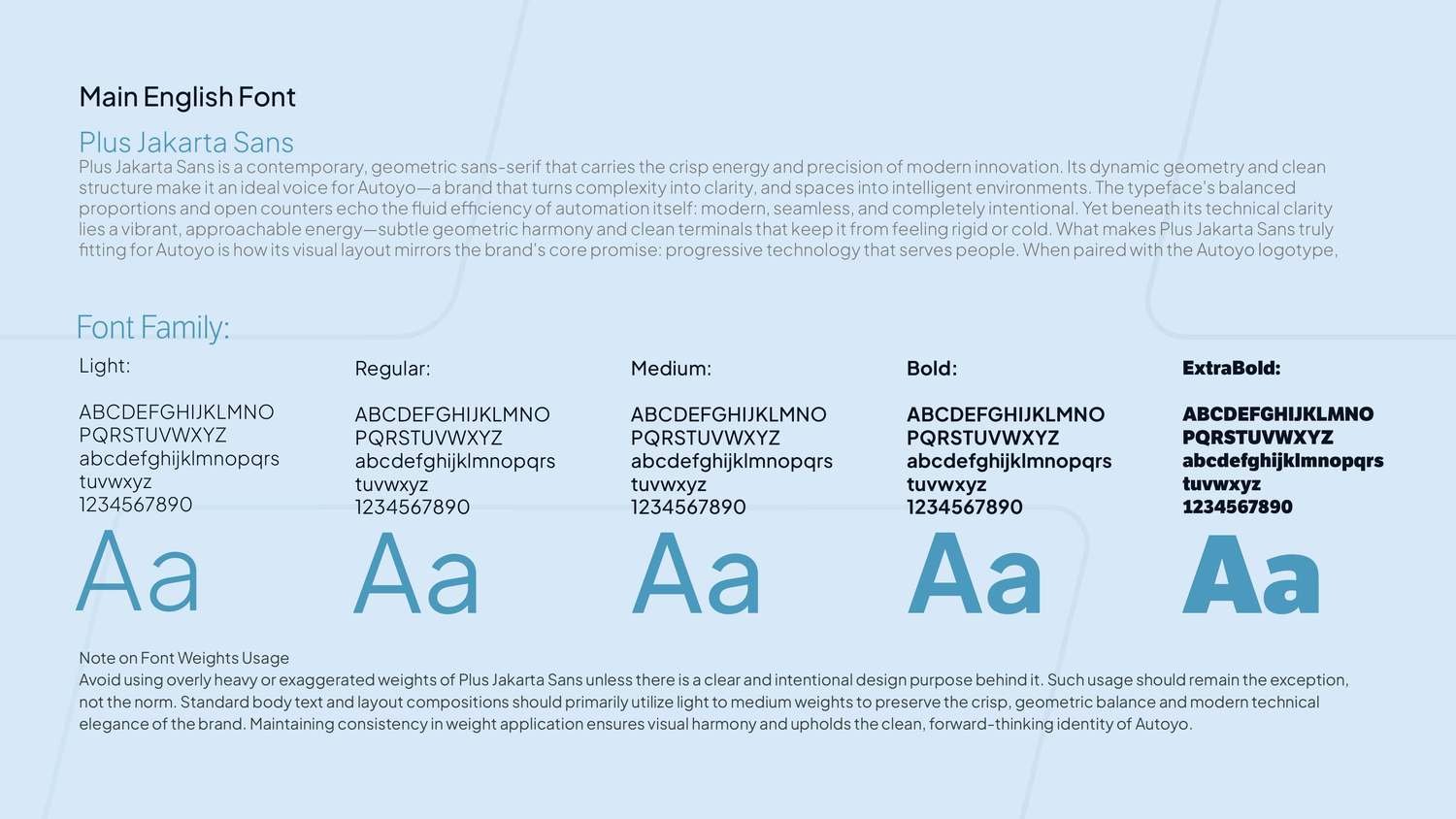
Typography
Typography

03  Photography

Technology that lives inside the moment — warm, real spaces where the product stays quiet.
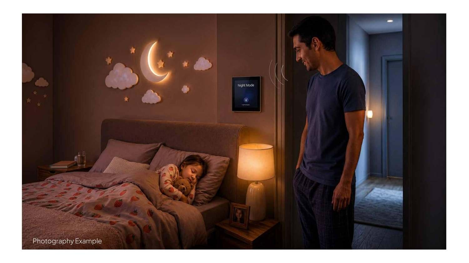
Photography direction
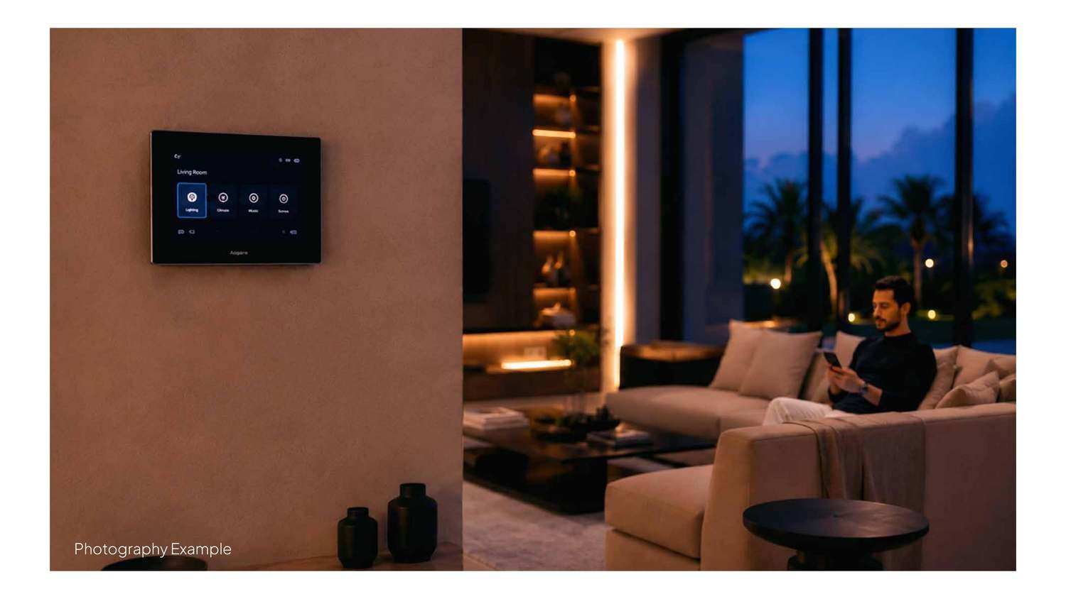
Living spaces
Living spaces
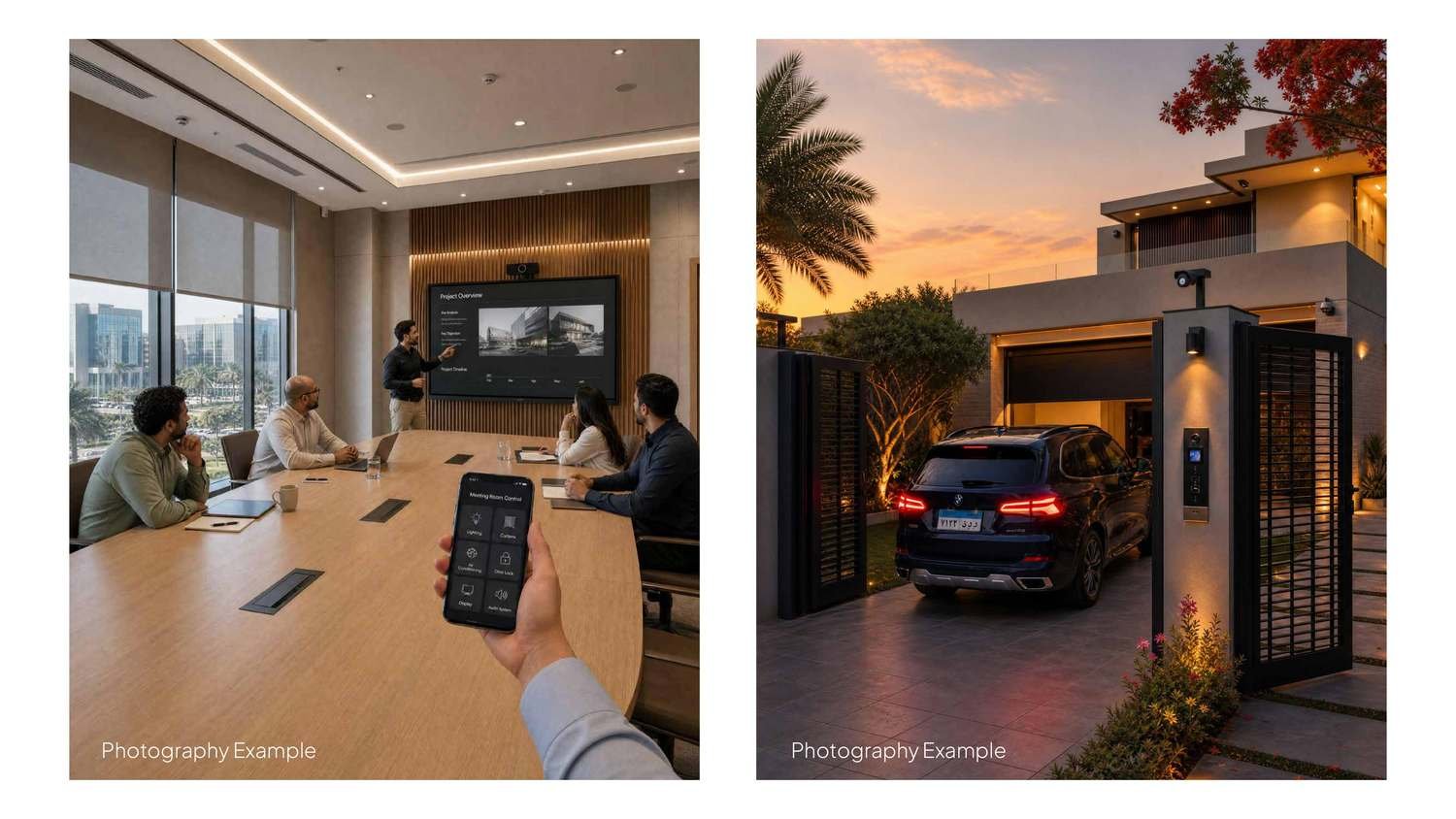
Connected home
Connected home

04  Real‑world applications

The system carried across stationery, packaging and the people who wear the brand.
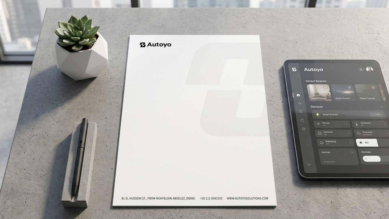
Stationery
Stationery
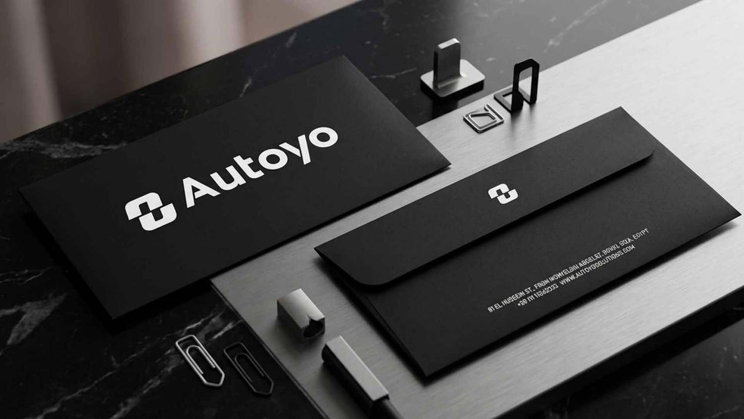
Dark stationery
Dark stationery
Flyer
Flyer
Packaging
Packaging
Workwear
Workwear
Inside the Autoyo store

Inside the Autoyo store

Technology should feel like part of the room — not the hero of the photograph. The experience comes first, the product second.

  The full brand book

Every rule, ratio and application in one place — open the complete 47‑page Autoyo brand manual.

What this includes
  • 01Logo system
  • 02Colour & typography
  • 03Photography direction
  • 04Real‑world applications
  • 05Brand book

Let’s talk it through,
in person.

Book a meeting →