
 ◈ Brand identity & launch social · Cairo
The one who
answers.
Mojeeb — مُجيب, Arabic for the one who answers — is an AI agent that replies to customers on WhatsApp, Instagram, Facebook and the web. We drew the mark, the Latin and Arabic wordmarks, the colour and the type, and the social that launched it. Then we did something an agency rarely does: we became the client.
Mojeeb answers Monzology's customers on every page of this site — including this one.
The signature gradient — the thing the brand is recognised by
01 A name with a promise
In Arabic, مُجيب isn't an invented startup word. It's an ordinary one: the one who answers. That is a generous name to start a company with, and a hard one to live up to — because the moment a brand says answer, every slow reply becomes a broken promise. The identity had one job before any aesthetic one: keep it.
The name already said it. The mark had to say it too.
02 The mark
A speech bubble, tipped and squared until it also reads as a screen — the tail at the lower left is the only part that stays literal. The green-to-teal gradient does the talking about technology, so the shape doesn't have to. What we left out matters as much: no headset, no robot, no three bouncing dots.


Primary lockup on white, and reversed on #0A0A17 — the mark keeps its gradient in both.

Five colourways — every background the brand actually lands on.
03 Held together by geometry
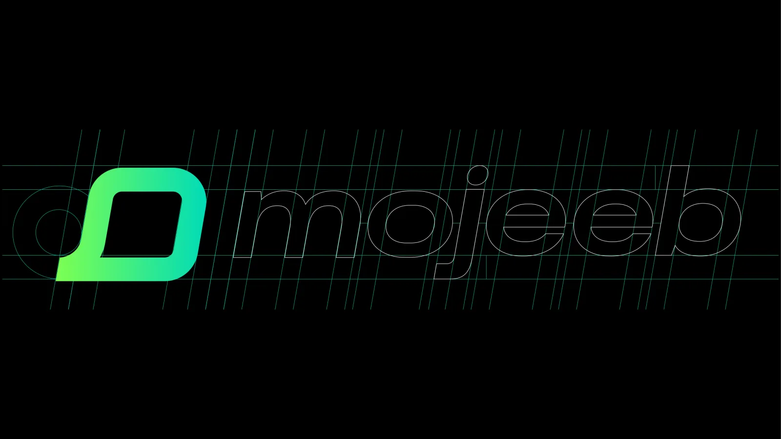
The mark is built on a grid, and that isn't decoration. It's what keeps the bubble readable at 32 pixels in a browser tab — which is where most people will actually meet this brand. The construction sheet is the contract between the logo and every size it will ever be used at.
The same lockup, stepped down to browser-tab size. Nothing collapses.
04 Arabic, drawn — not translated
مُجيب was never going to be a font substitution. We drew the Arabic to stand beside the Latin at the same weight and the same geometry, then moved the mark to the right so the lockup reads the way Arabic reads. Most brands in this region end up with a translated logo. Mojeeb got a second original.
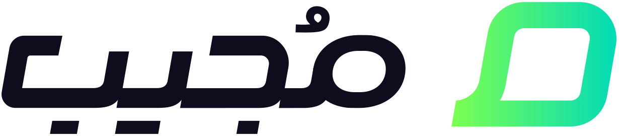

The Arabic lockup — same weight, same geometry, mark moved to the right for RTL.
05 Two greens, and why there are two
Most software brands pick one colour. Mojeeb runs two, because they do two different jobs. #7DFF51 is a signal — high-chroma, almost yellow, the green of a notification dot and a status light. #00DBB7 is a surface — cooler, calmer, the green of software rather than of a highlighter. One is for the moment something happens. The other is for everything around it.
Then there's where this brand actually lives. A customer meets Mojeeb inside a WhatsApp thread — on a screen that already has a famous green on it. Measured as hue angles, Mojeeb's two primaries sit on either side of WhatsApp's: one 37° warmer, one 28° cooler. The brand stays inside the colour language of messaging without ever being mistaken for the app carrying it.
And the ground they sit on isn't black. #0A0A17 is 10 red, 10 green, 23 blue — a near-black with a deliberate blue bias. Pure #000 makes a high-chroma green vibrate at its edges; a blue-leaning ground cools it, so the green reads as light being emitted rather than paint being applied. This page is set on that exact colour.
Three primaries, five supporting tones, and the two gradients — light, and the dark variant that carries the night-mode work.
- 01Two primaries, two jobsThe green announces. The teal holds. If both are doing the same job on a screen, one of them is decoration.
- 02Keep the greens rareEvery supporting tone is low-chroma on purpose — near-whites, a grey-green, one acid yellow held in reserve. A colour that turns up everywhere stops meaning anything.
- 03The gradient is the signatureBetween two adjacent hues there's no muddy middle, so the sweep stays clean at any size — which is why it's the one element that never gets flattened.
06 Two typefaces, one voice
Alexandria carries the Latin. Loew Next Arabic carries the Arabic. Here is the part worth noticing: both families can set both scripts. The system takes one half of each anyway — because a bilingual family always favours the script it was drawn for first, and this brand couldn't afford a second-best half in either language.
Alexandria
Drawn by Mohamed Gaber, a type designer in Cairo. Open-source, nine weights, variable — its Latin built on the geometry of Montserrat. An Egyptian product wearing a Latin typeface drawn in Egypt.
لوي نكست أرابيك
Loew Next Arabic, by Jonathan Hill at The Northern Block — a modernist sans reworked so its Arabic carries the same weight and the same level of detail as its Latin. Quiet, unornamented, built to be read on a screen at speed.
The temptation in every bilingual system is to make the Arabic look like the Latin. It can't. The scripts are built differently — one sits on its baseline, the other hangs off it; one is assembled from separate letters, the other is written as a connected line. What can be matched is weight, rhythm, the size of the counters and the amount of air between letters. Match those and the two scripts read as one voice. Match the shapes instead and you get an Arabic that looks like a translation of something else.
- 01Match weight, not shapeThe Arabic and the Latin should look like the same person speaking two languages — not like one script wearing the other's clothes.
- 02Geometry answers geometryThe mark is a rounded rectangle with a wide, open counter. Both typefaces are geometric with open apertures, so the wordmark's bowls echo the shape sitting next to them.
- 03Optimise for small, not for slidesThis brand is read in chat bubbles and browser tabs. Both families stay legible at text sizes, which matters more here than how they look set at 200px.
07 Out in the world
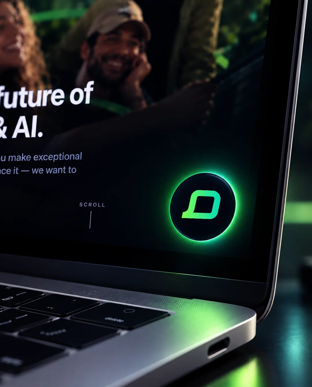
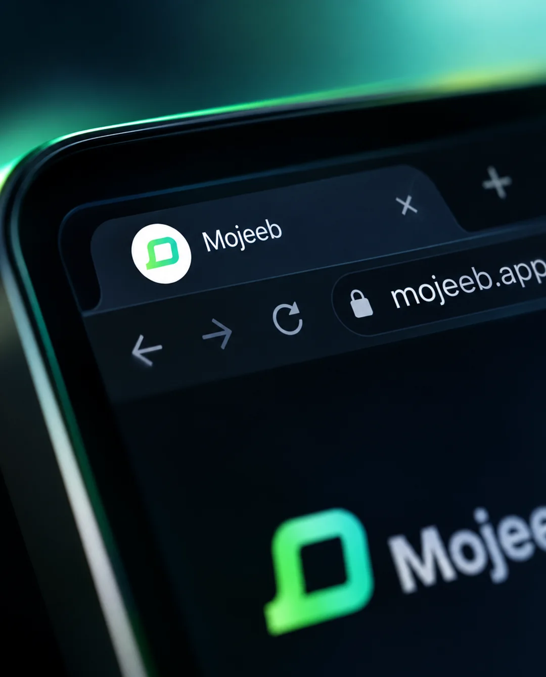
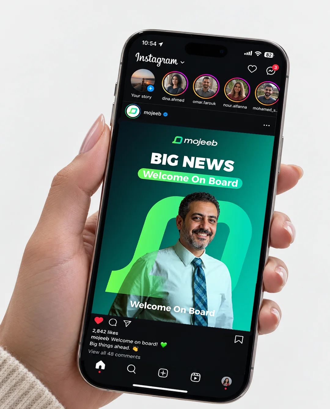
A glowing green button in the corner of a laptop. A favicon in a browser tab. A “BIG NEWS / Welcome On Board” post in a feed. Almost nobody meets this identity on a presentation slide — they meet it at 32 pixels, in a corner, while they are waiting for an answer. It was designed for that.
The identity's real home — a bubble, a gradient, and someone answering.
08 And then we became the client
There is one test a product brand can't argue with: do the people who made it pay for it? We do. The green button in the corner of this page is a Mojeeb agent, answering Monzology's clients in Arabic and English while we're asleep. Our founder's words sit on their homepage now — not as a favour, as a customer.
“Our ads bring a flood of messages, and real leads used to get lost. Mojeeb pulls out the serious ones so we see which campaigns are working.”
Ahmed Mounir · Founder & CEO, Monzology — on mojeeb.appFigures published by Mojeeb on mojeeb.app. Monzology designed the brand and is a paying customer of the product.
- 01 Logo & mark design
- 02 Latin wordmark
- 03 Arabic lockup — drawn, not translated
- 04 Logo construction & grid
- 05 Colour system & gradients
- 06 Typography system
- 07 Brand presentation
- 08 Launch social designs