01 Logo system
A bold ‘T&D’ mark inside a Majestic‑Orange block, with a full wordmark lockup.
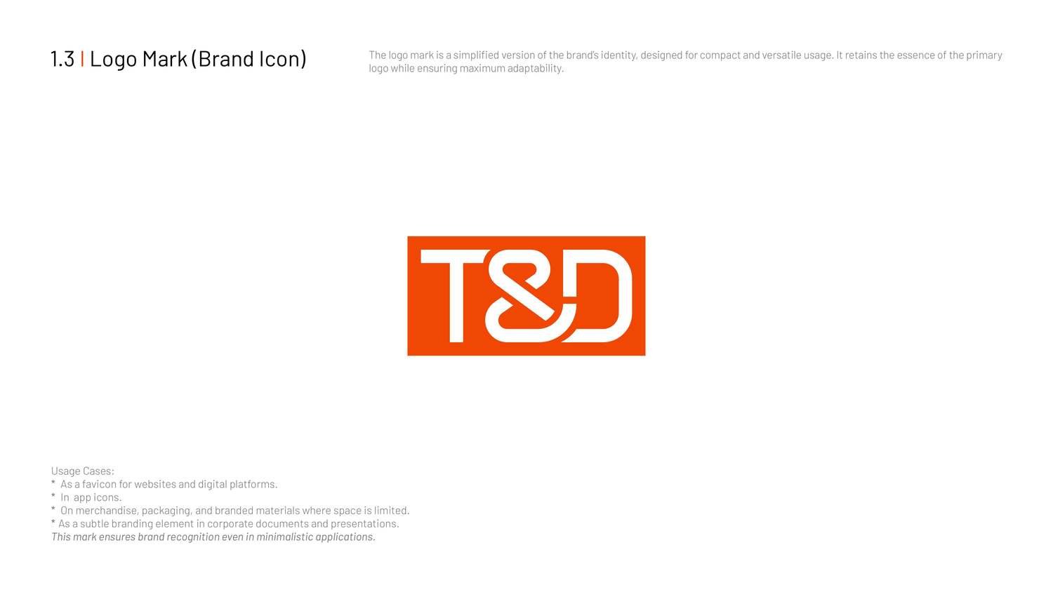 Brand mark
◈ From sketch to system
Before the final mark, the identity went through weeks of exploration — dozens of pencil studies of the T, the D and the ampersand.
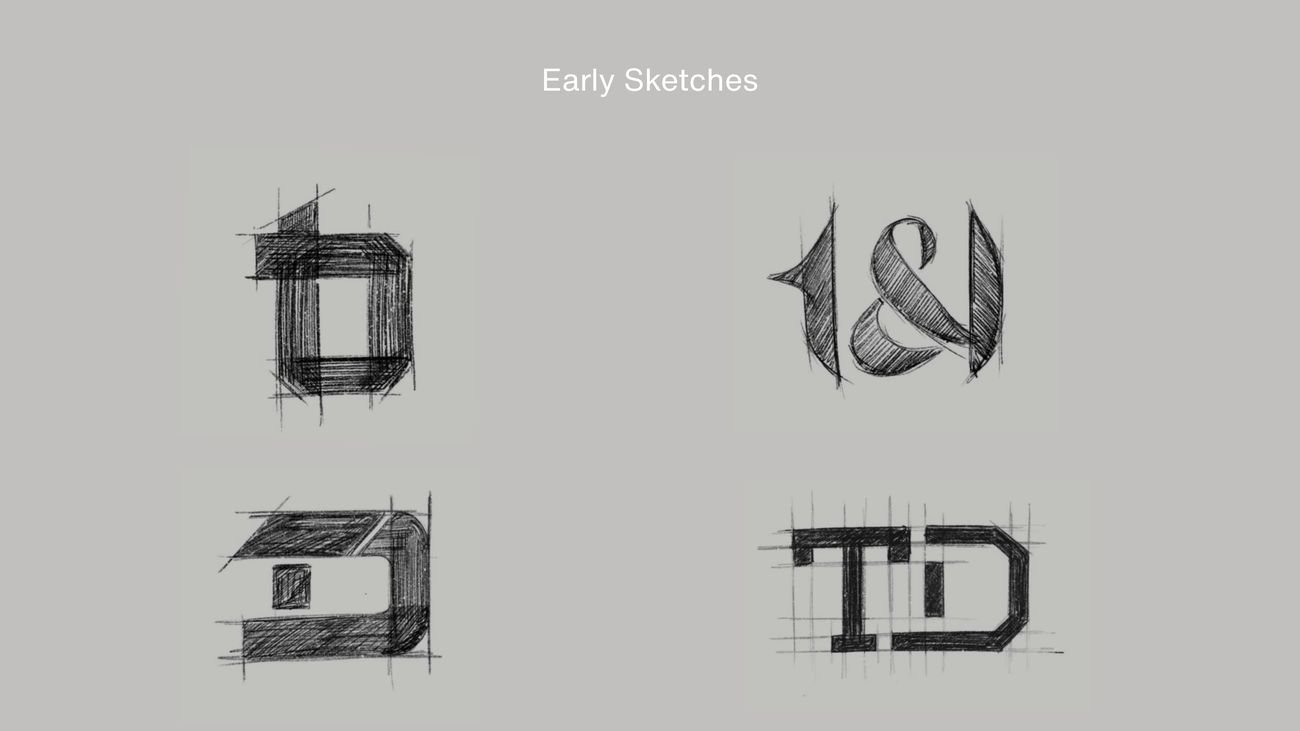 Early sketches — first concepts
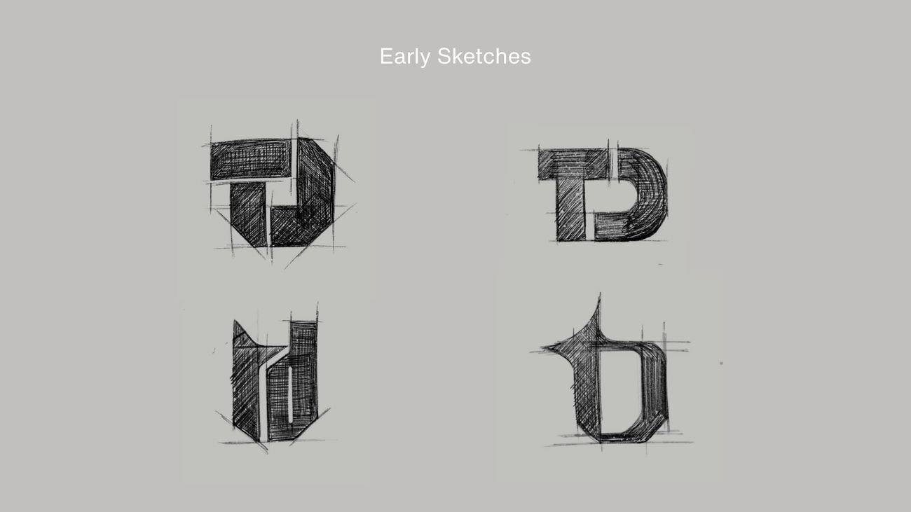 Refined studies
Two complete directions were developed and presented — an elegant ampersand wordmark, and a bolder geometric T·D monogram. T&D chose the ampersand: timeless, editorial and unmistakably theirs.
 Selected — ampersand wordmark
 Also explored — geometric monogram
02 Colour & type
Majestic Orange, Executive Grey and Clear White — backed by a warm supporting palette of Soft Beige, Sky Mist, Champagne Sand, Pale Sage, Light Grey and Deep Onyx.
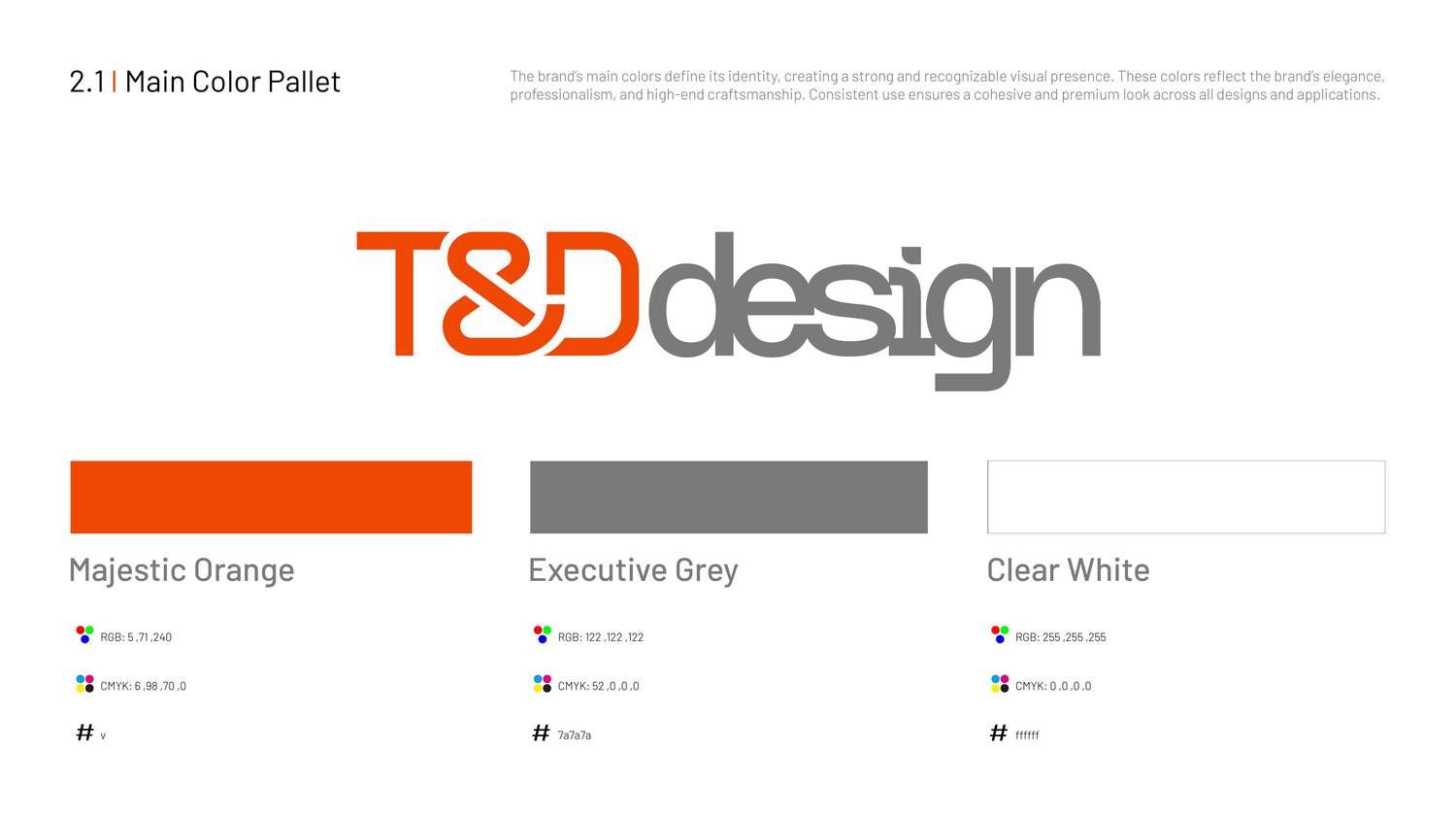 Colour palette
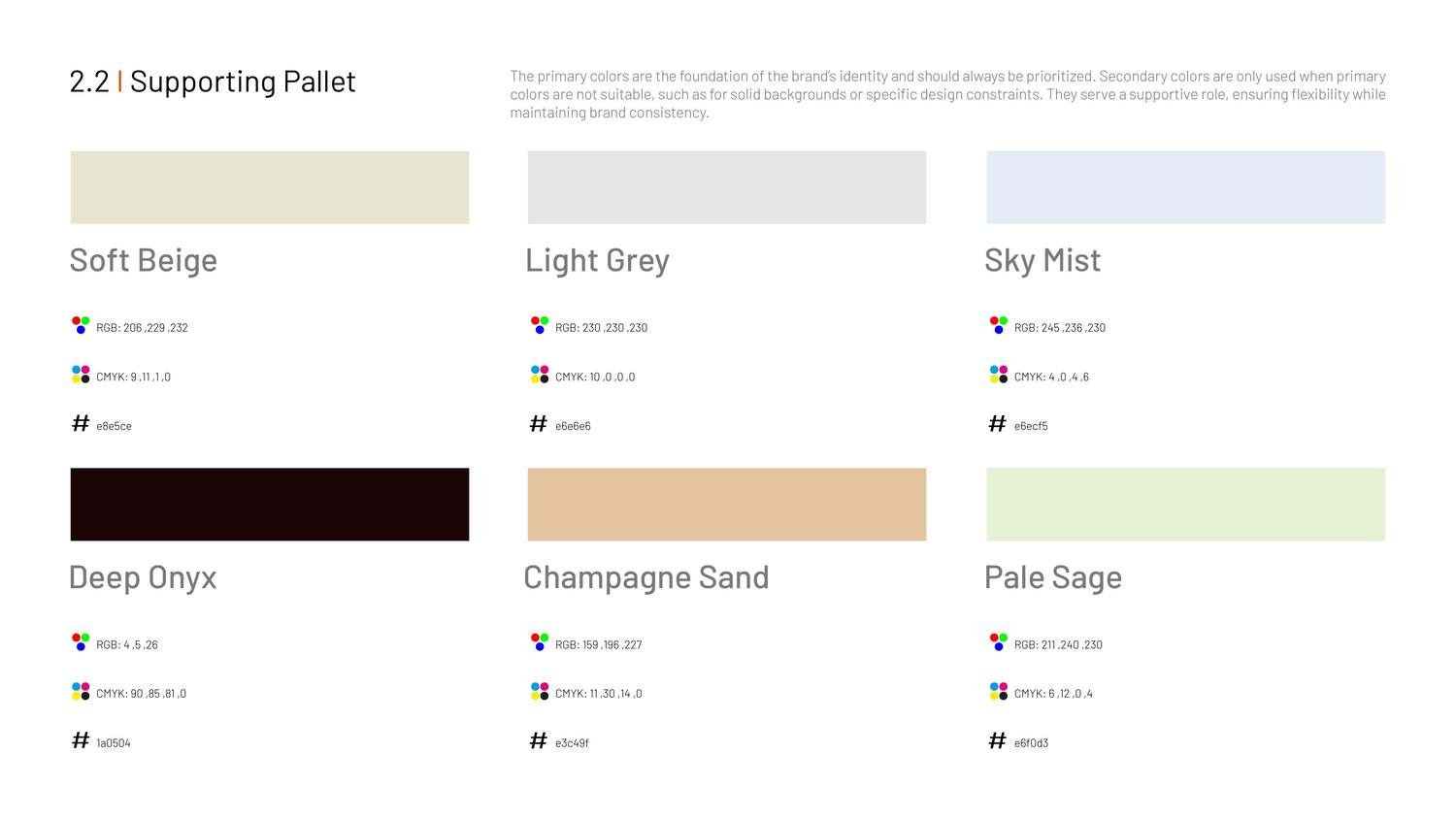 Supporting palette
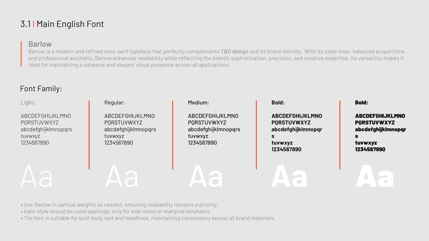 Typography
03 Photography
Calm, considered workspaces — the environment the brand lives in.
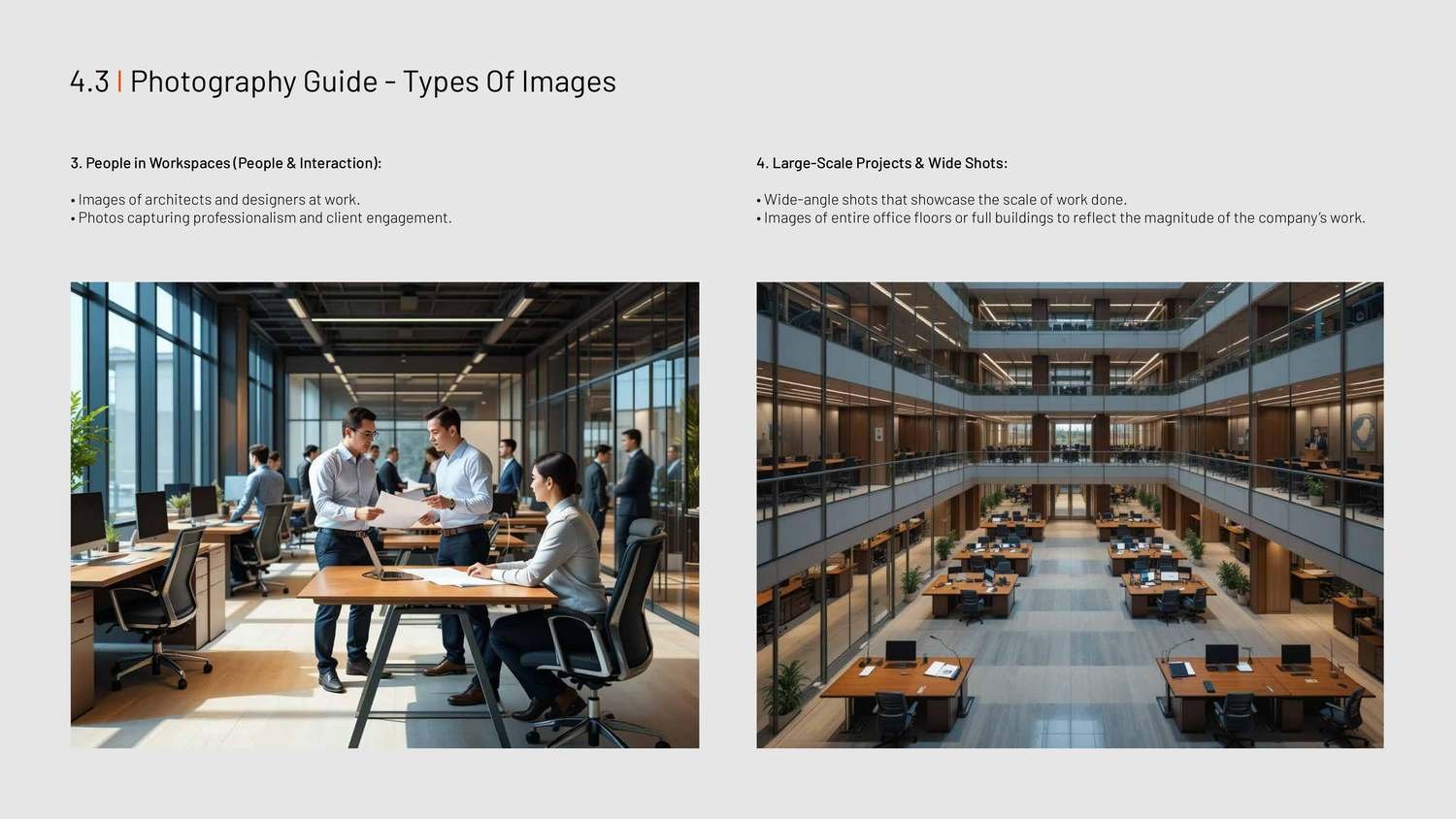 Photography direction
04 Applications
Applied end to end — stationery, campaigns, apparel, merch, fleet and large‑scale signage.
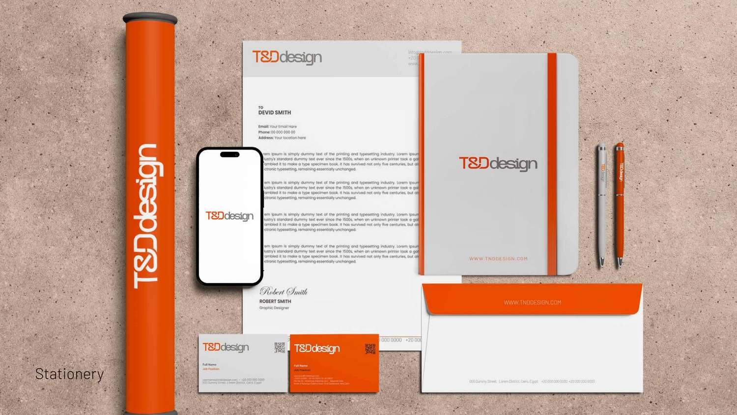 Stationery suite
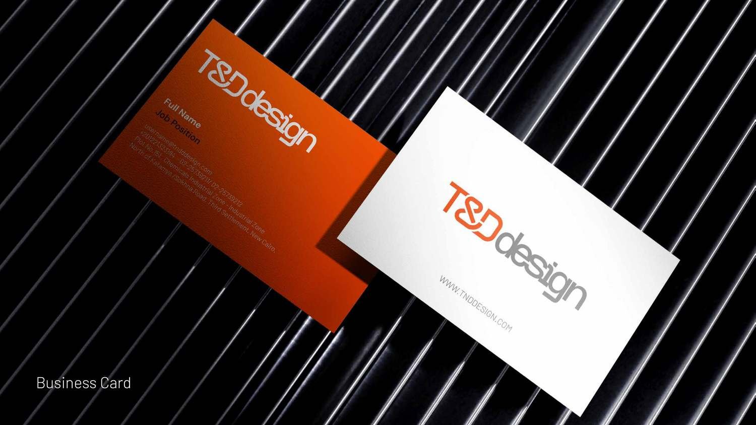 Business cards
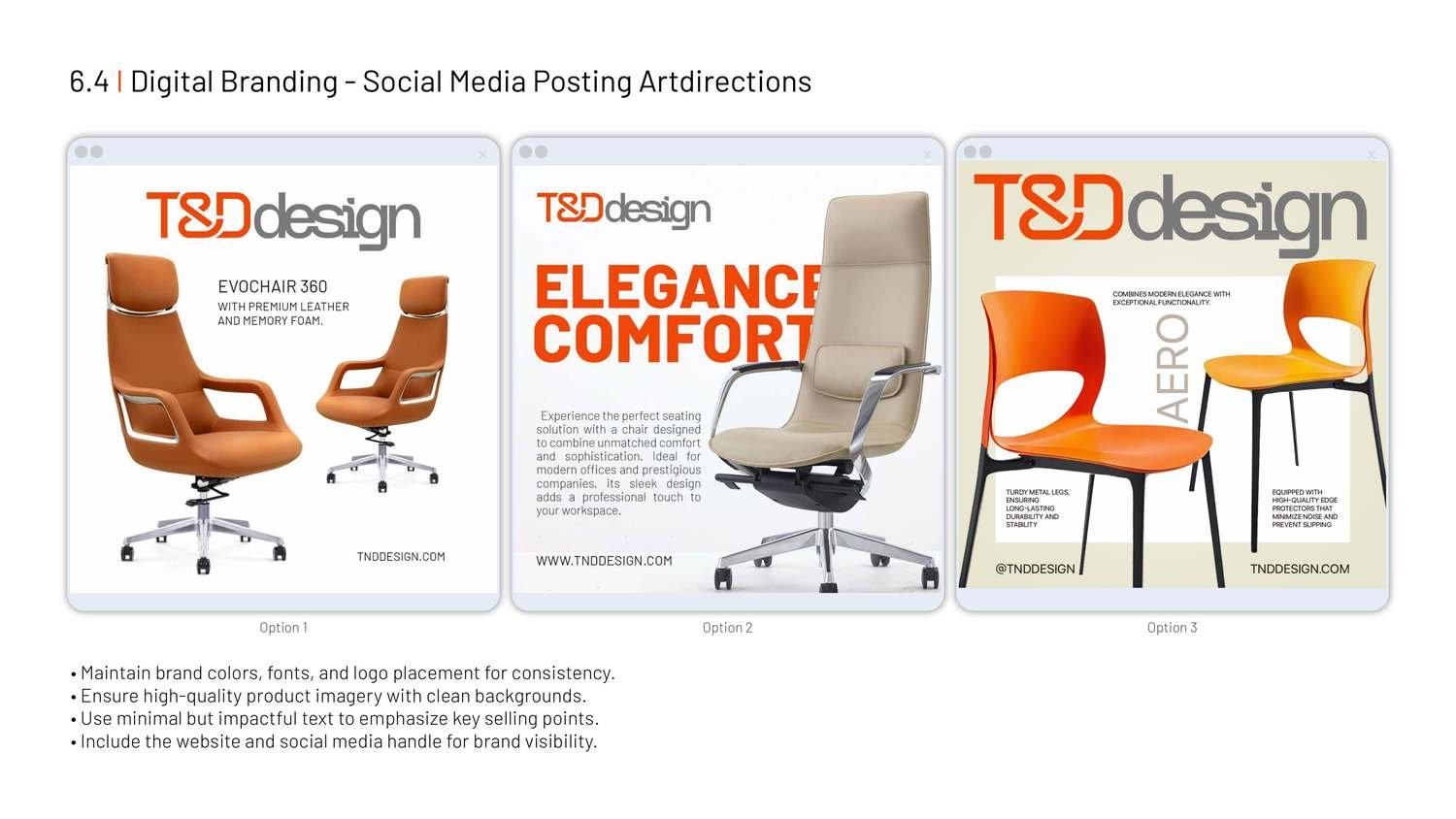 Social & campaign
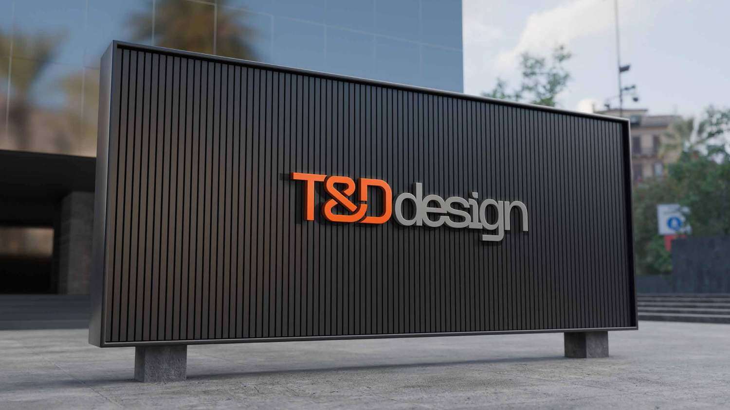 Outdoor
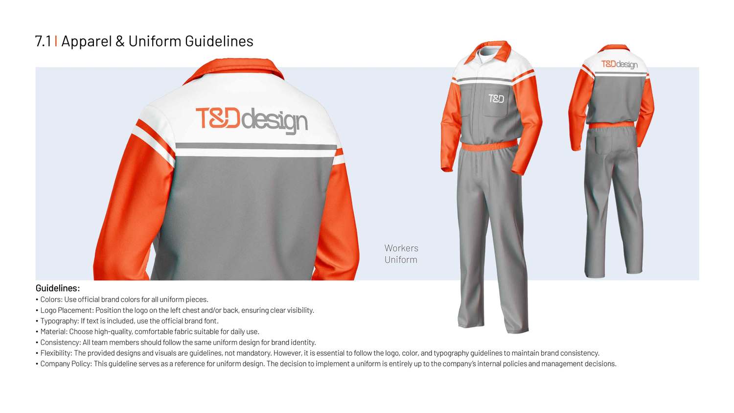 Apparel & uniforms
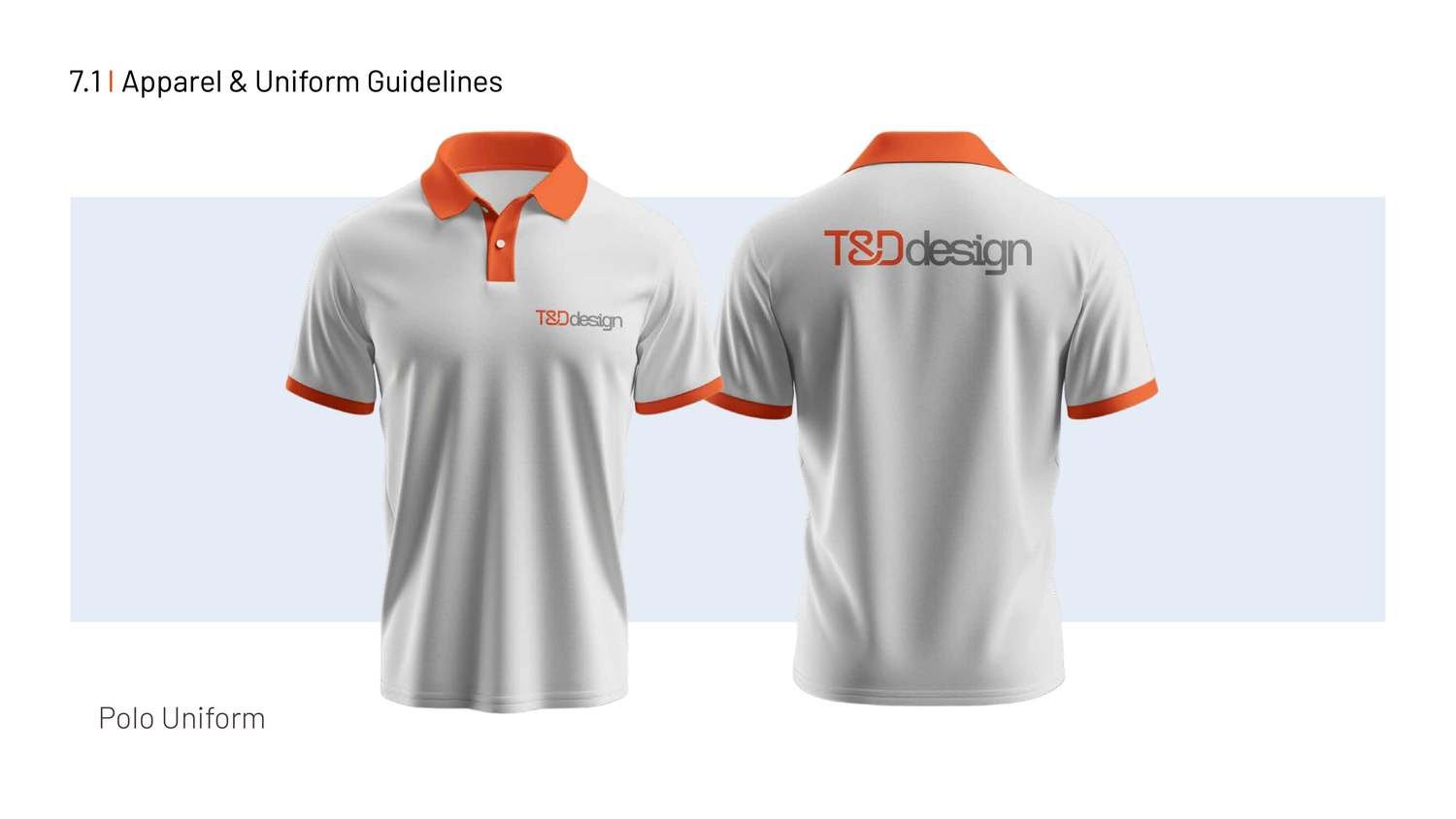 Team polos
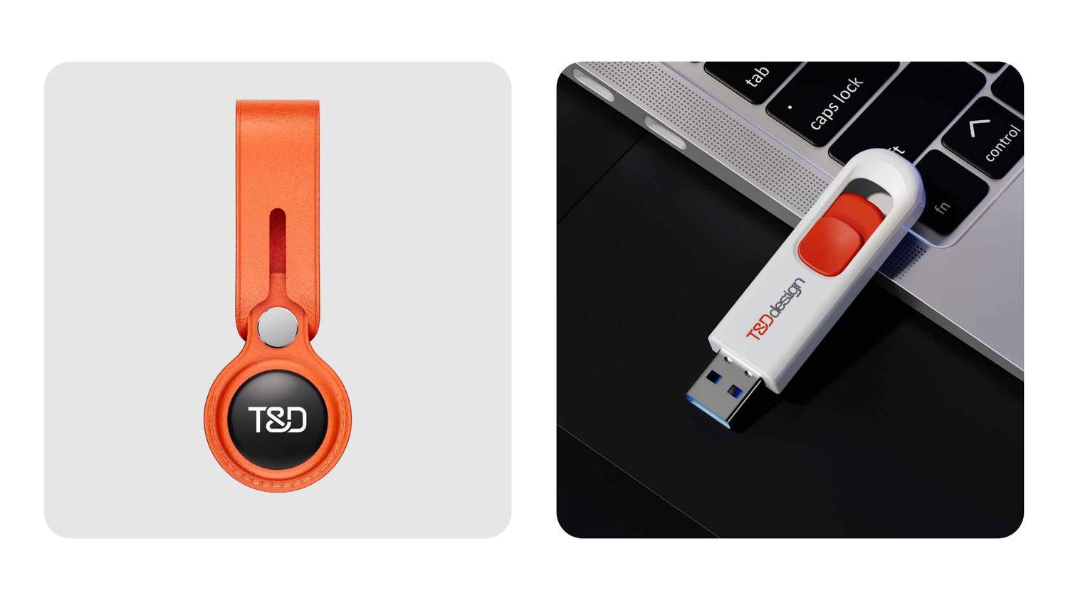 Merchandise
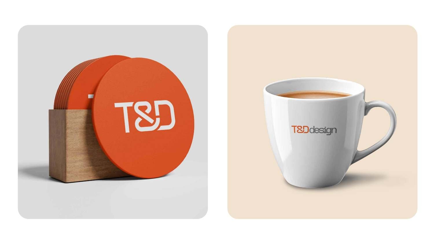 Drinkware
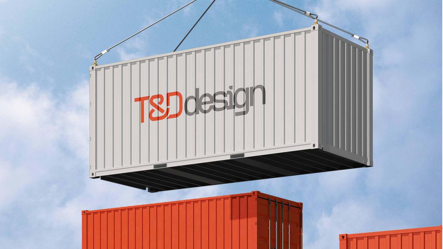 Shipping livery
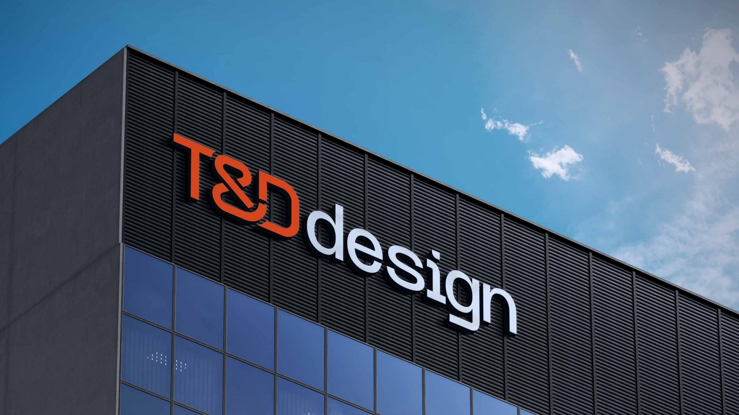 Building & facade signage
◈ The full brand book
Every rule, ratio and application in one place — open the complete 60‑page T&D design brand identity manual.
05 In the feed
The identity brought to life — product‑led social posts for the T&D design seating range.
Social campaign · seating range
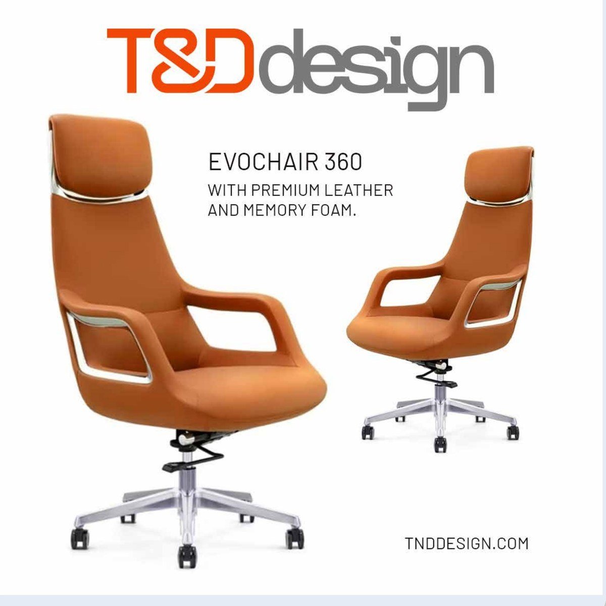 EVOCHAIR 360 — premium leather
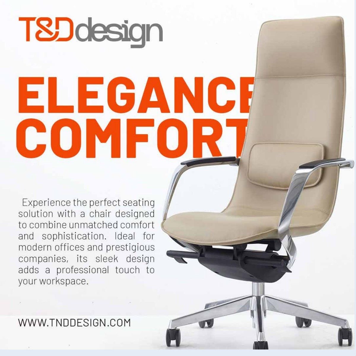 Elegance & comfort
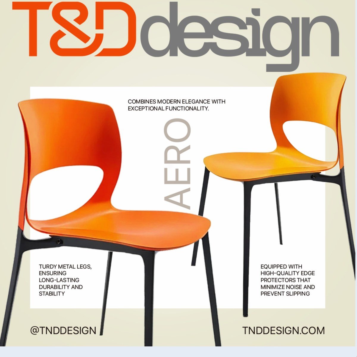 AERO — modern & functional