← Selected work ◈  SUB Constructions — Brand Facelift

We shape our homes,
our homes shape us.

SUB is a construction & interiors house that builds spaces people grow into. We gave it a full brand facelift — a market study, an art direction, and a new mark drawn straight from the letters S + U + B: an arch that reads as a home, a gateway, and a quiet stair toward something better.

Minimal. Architectural. Warm.نحن نصنع بيوتنا، ثم تصنعنا بيوتنا.

ClientSUB Constructions — Zamalek, Cairo
ScopeBrand facelift · Logo & identity system
RolloutPrint · Packaging · Web · Social
The SUB brand mark — an arch monogram built from the letters S, U and B — in gold above the SUB wordmark, on a warm charcoal ground Monzology Creative Boutique

  The approach — a long look before a single line

After a long journey of market study and artistic research, one direction kept winning: minimalism. Not because it’s trendy — though it is — but because clean lines and a warm, monochromatic palette read as calm, elegant and expensive across every culture and taste SUB serves. So we started by collecting the world SUB should live in.

A moodboard of minimalist interiors — arched niches, cream walls, sculptural furniture and warm neutral tones
Visual references — the arches, the calm, the neutrals
A colour study pairing interior photographs with extracted swatches of warm neutrals, sage and terracotta
Colour study — pulling a palette from real rooms

01The mark — from pencil to system

We sketched dozens of routes before the shape settled. The winner wasn’t the loudest — it was the one that hid the whole name inside a single, quiet silhouette.
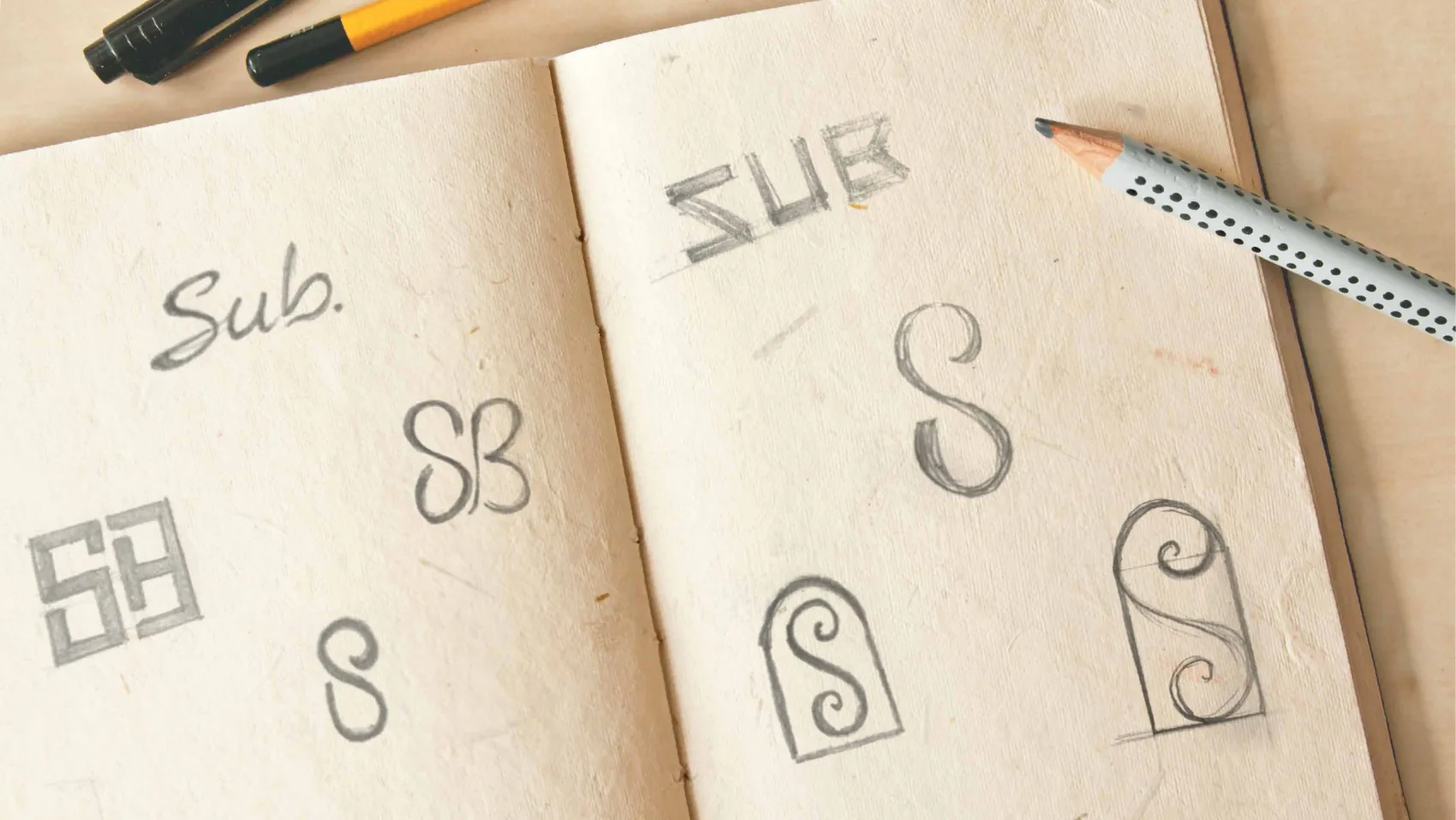
Pencil sketches in a notebook exploring SUB monogram routes — SB ligatures, framed marks and an S inside an arch
Exploration — a notebook full of routes
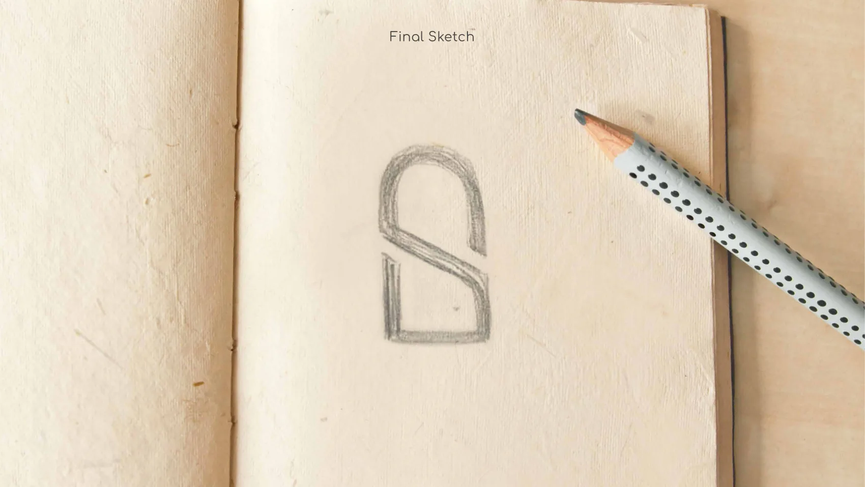
The final pencil sketch — an arch with a diagonal stroke forming an S
The final sketch — the arch, and the stair

02S + U + B, folded into one

Look once and you see an S. Look again and the U and B are there too, blended into the same continuous line — three letters, one mark.
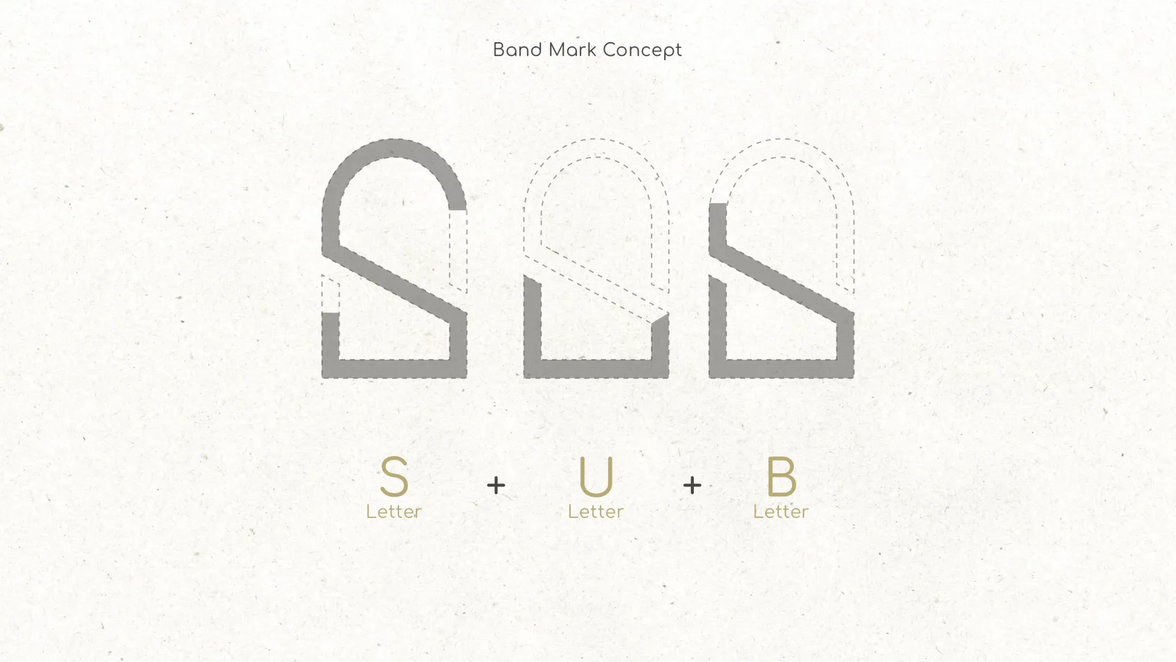
The band-mark concept showing how the S, U and B letterforms overlap to build the single SUB monogram
Band-mark concept — S + U + B sharing one skeleton
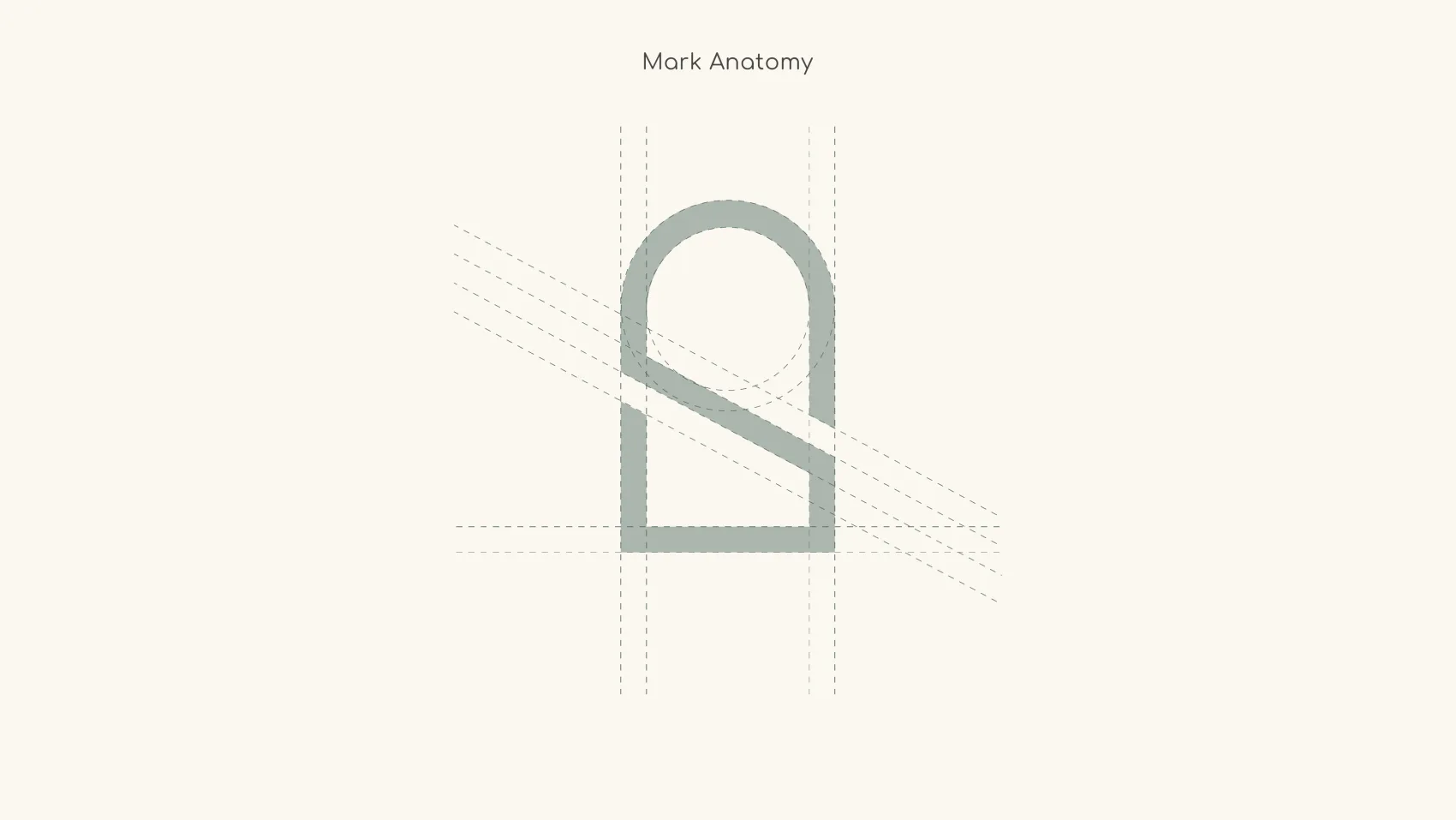
The geometric construction of the SUB mark, built on a grid with a circular arch and angled guides
Mark anatomy — drawn on a strict geometric grid

03Reading the mark

The Arch

An arch is inherent to almost every architectural language, and it always signals elegance and subtlety. As a gate or a window, it quietly promises comfort and optimism.

The Letters

At first glance the S reads clearly — but look closer and the U and B are there too, blended together inside the same mark.

The SUB arch monogram in gold

Stairs of Prosperity

The diagonal line running through the mark is a simplified stair — so the whole composition becomes a gateway to progress and prosperity.

One silhouette

A home, a doorway, a letter and a stair — held in a single monoline shape that works from a wax seal to a building sign.

04The same mark, every material
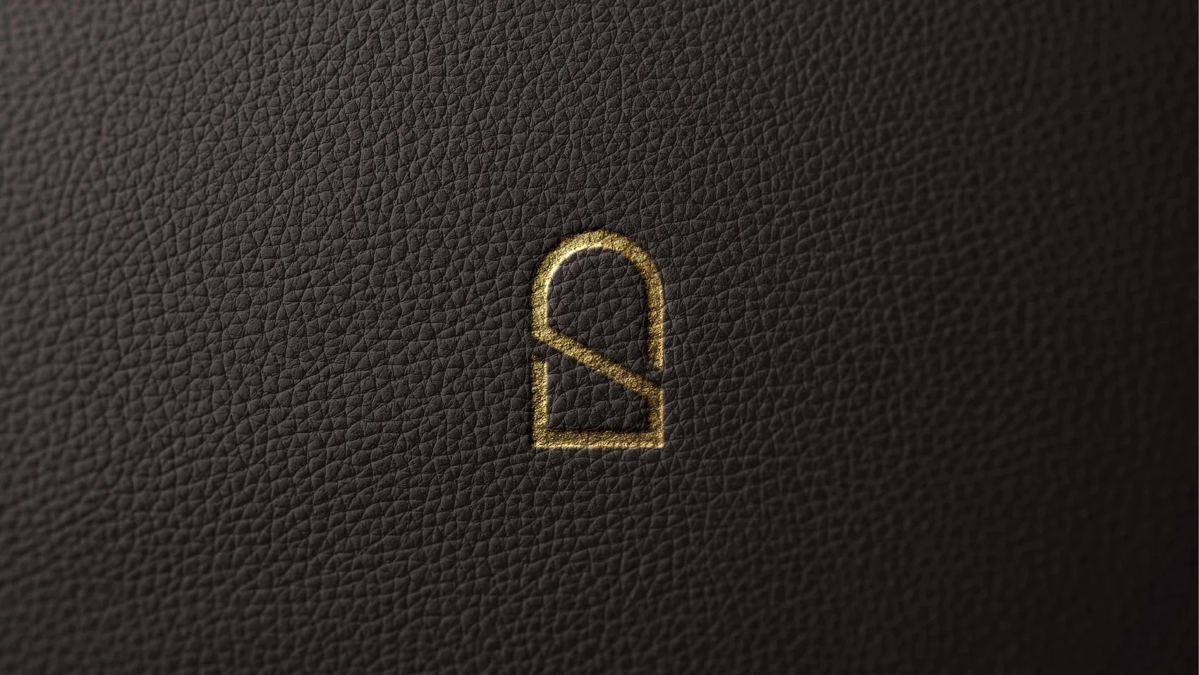
The SUB mark blind-embossed in gold on dark leather
Gold foil on leather
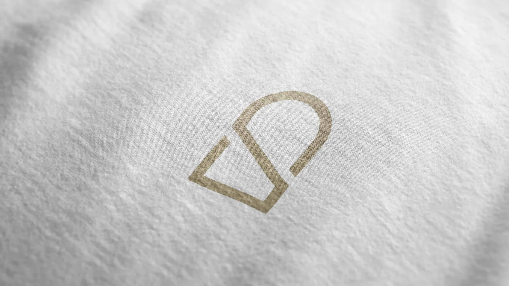
The SUB mark printed in gold on white fabric
Printed on fabric
The full SUB lockup in gold foil on a rich brown ground
Foil lockup on brown

05The palette — warm, quiet, expensive

Classy Gold
#B8A976
Fresh Cream
#F7F2E1
Warm Shadow
#474543

Secondary colours — a warm, natural range pulled from real rooms

#CACFB7
#49645D
#9C6F5F
#EEA489
#F7CCC3
#B8B098

06The typeface — rounded, and hand-signed

Main font
Comfortaa
ABCDEFGHIJKLMNOPQRSTUVWXYZ
abcdefghijklmnopqrstuvwxyz
0123456789   &   @   #
Autography

Comfortaa carries the whole system — its geometric, rounded letterforms echo the arch in the mark, so headline and logo feel cut from the same cloth. A hand-signed script, Autography, comes in for the human touch: a signature on a card, a warm note on a cover.

07Out into the world

A brand is only as good as the day it ships. We rolled the system across everything a client actually touches — from the card in their hand to the seal on the envelope.

The SUB stationery set — business cards, letterhead, envelope and document folder in olive and cream
The stationery set — cards, letterhead, envelope, folder
SUB business cards, olive and cream, resting on a wooden surface
Business cards — two-sided, two tones
A gold wax seal stamped with the SUB mark on a black envelope, next to a brass seal stamp
The wax seal — the mark as a stamp

08Catalogue & print

A SUB catalogue held in two hands, its gold cover showing the mark above an interior render
The catalogue — interiors, told in SUB’s voice
An open SUB magazine spread showing interior renders and body copy
Editorial spreads
A SUB tri-fold brochure, unfolded, showing interior photography and the mark
The tri-fold brochure
Two arch-shaped cards carrying the SUB mark — one cream with gold foil, one dark grey
Arch-die-cut cards — the mark, made physical

09Web & social

The SUB website on a laptop, showing the mark, an interior photograph and body copy
The website — the system, on screen
Two SUB Instagram posts — Premium Furniture and Wooden Concepts
Social — premium furniture
Two SUB Instagram posts — Made from the finest resources, and Artistic Zone
Social — finest resources
A hand holding a phone showing the SUB Instagram feed
In the feed

10SUB’s edge — is it real?

Is it real?

SUB’s advantage is making 3D designs look genuinely real. So the photography rule became a game: leave the viewer unsure whether they’re looking at a photograph or a render. Every “beauty shot” in the system is built to blur that line.

A chair shown half as a photorealistic 3D render and half as a wireframe, asking whether it is real
Close-up beauty shots of SUB furniture — a marble tabletop and a leather-and-wood chair engraved with the mark
Beauty shots — the mark, engraved in the detail
More SUB furniture beauty shots — upholstery, walnut joinery and warm light
Photography that could be a render — or the other way round

  The full facelift

Every page of the SUB brand facelift, cover to cover — flip through the complete deck exactly as it was presented.

What this included
  • 01Market study & art direction
  • 02Logo & monogram system
  • 03Colour & type system
  • 04Print, packaging & stationery
  • 05Web & social templates
  • 063D & product photography direction

Let’s shape your brand,
the same way.

Book a meeting →