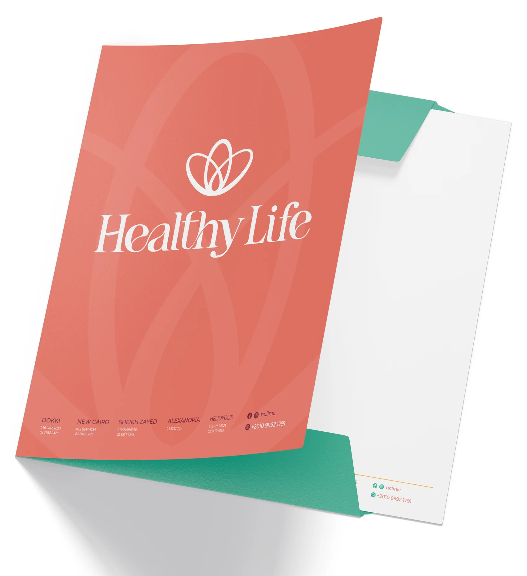
◈ The facelift — before we planned the pages, we redrew the mark
The old identity had real charm — a warm, hand‑drawn wordmark and a calm, well‑chosen palette. But as Healthy Life grew into a multi‑branch clinic, the mark started to work against it. So we kept its soul and rebuilt its structure — same warmth, a steadier hand.
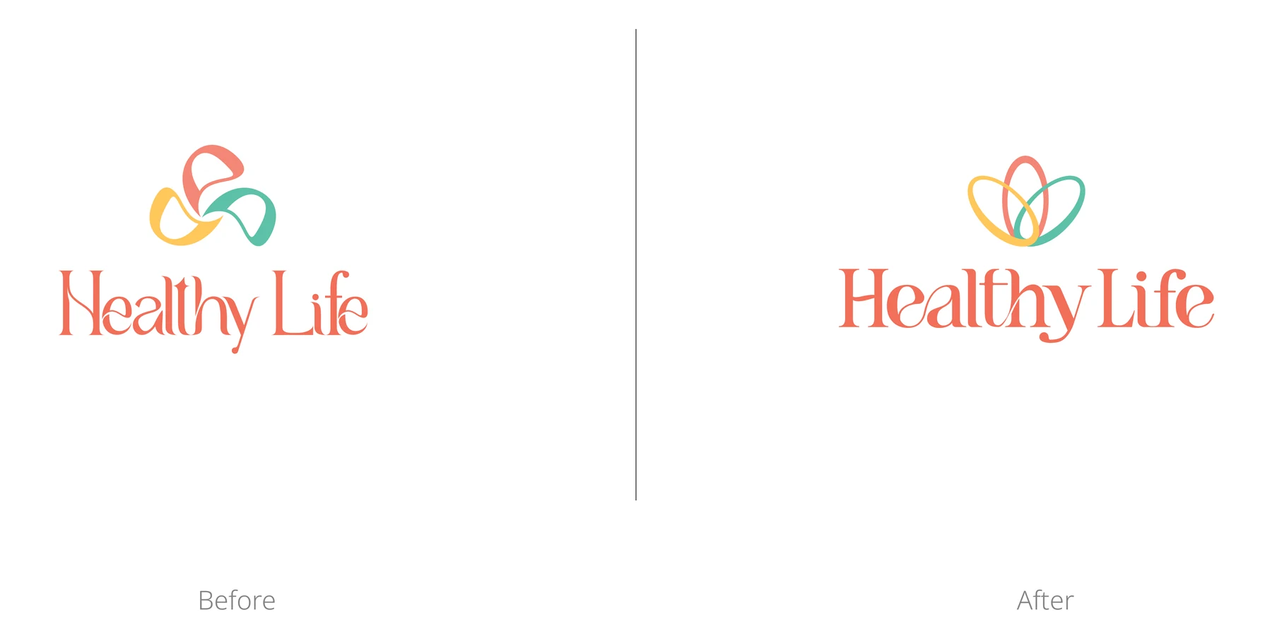 Before & after — the same voice, drawn with a steadier hand
01What we kept, what we fixed
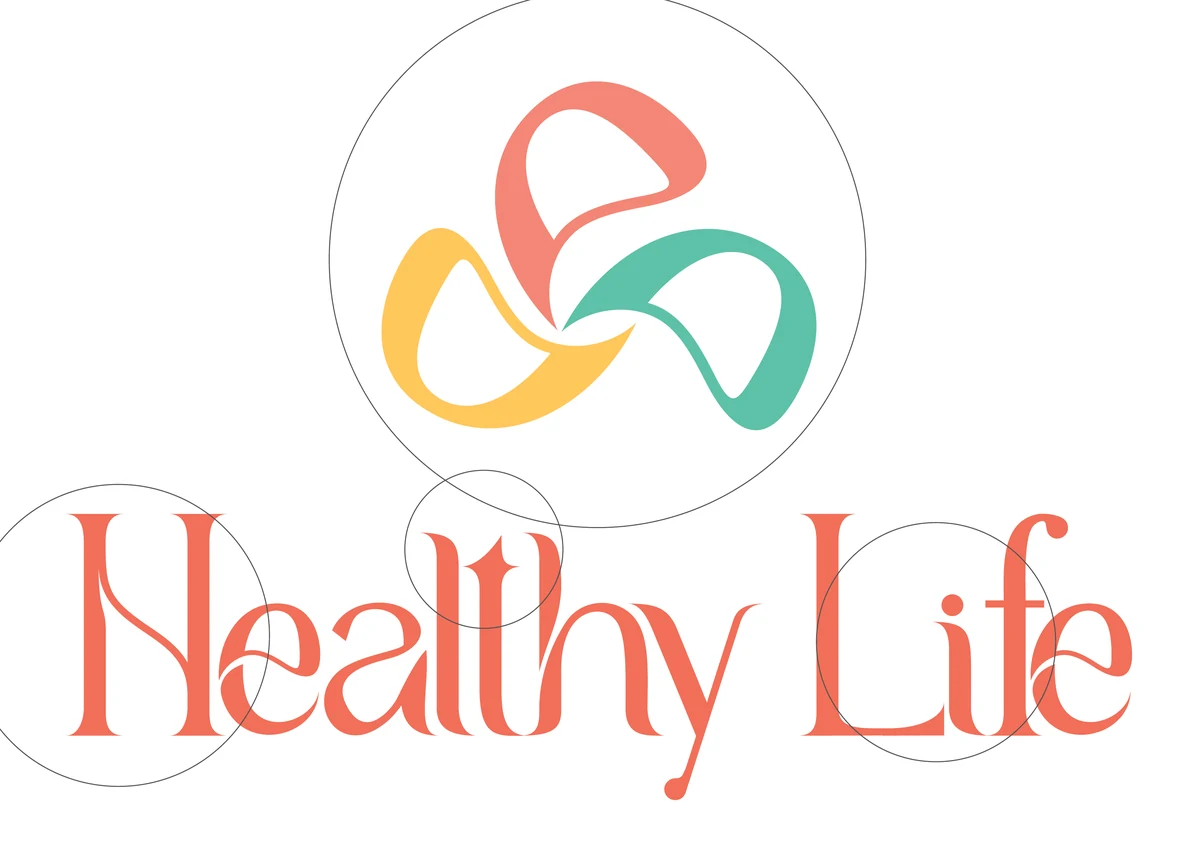 The original mark, under the loupe
What worked
- A warm, hand‑drawn wordmark — soft, smooth and approachable
- A refreshing, calming colour palette worth keeping
What held it back
- The wordmark was hard to read — the “H” kept looking like an “N”
- Letter‑spacing ran uneven — tight in places, loose in others
- The icon looked lovely but wasn’t balanced, so it broke down at small sizes and across formats
02Soul, body & mind — one flourishing life
Rooted in the name itself, the care goes beyond nutrition — it holds every part of well‑being. Three petals, one flower.
Soul
+
Body
+
Mind
→
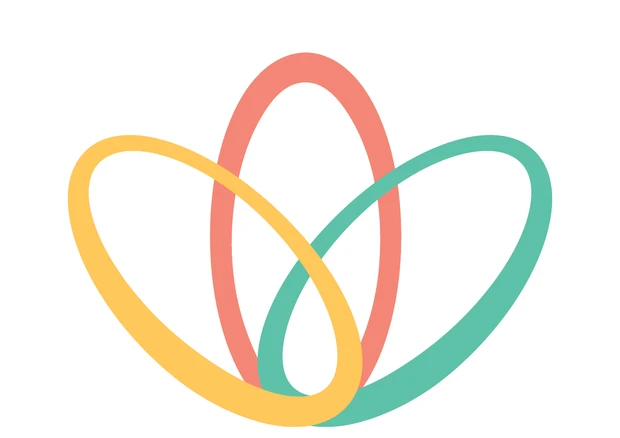 A flourishing life
Look again and the flower reads as a crown — achievement, and the pursuit of a fuller life.
03We kept the handwriting, and steadied the hand

The refined wordmark keeps the fluid, hand‑drawn feel that makes the brand feel human — then evens the spacing, refines the proportions and balances the stroke weight. It reads in an instant now, and carries a quieter note of trust and professionalism.
04One mark, every surface
 The resolved lockup — icon and wordmark, finally in step
 Single‑colour — on coral
 Single‑colour — on teal
05Out into a growing clinic
The new system rolled out across five branches — Dokki, New Cairo, Sheikh Zayed, Alexandria and Heliopolis — starting with the folder that carries every plan home.